
Once upon a time there was a test lead who didn’t believe in agile. She used to nod politely when teams talked about reducing waste, sprints and small deliveries. Then she turned around and did it The Right Way. Which, to her defense, worked. Her projects were typically on time, upheld a great quality standard and the launches usually were calm and fearless affairs.
Then one day, she hit the wall. A “simple” migration project with the simple goal of “make it work the same way as before”. Lift and shift. Piece of cake. However, this was a newly formed team. The application potentially had millions upon millions of possible combinations. Previous testing activities were badly documented. Requirements and expected behavior were unclear, missing or even contradicting each other. A number of nasty bugs nestled deep down in overly complicated code. This project started to look like an insurmountable challenge. Add to this a very strained relationship with the users and management, putting the pressure on the team that this was their last chance. This had to turn out well or they would never be allowed to refactor anything again. Time was scarce and information was limited.
Our beleaguered test lead tried to stand her ground, but the fates would just not let her have the 6-12 months she needed. She was close to giving up when suddenly a bright-eyed tester in her team suggested looking into mind maps. In a day, thanks to mind mapping, our hero changed her outlook entirely.. They managed to turn the testing from slow, repetitive and confused to a sleek, risk-based and context-driven testing machine. That test lead was me, and I want to share some of my love of visual models and how it could help you as well.
We will get back to the project later on. First let’s dig into models, especially visual models.
Visual Models – How And Why Do They Work?
A Model is a simplification of reality created with a certain purpose. It is never the whole truth – but an aspect of that truth that we can use to fulfill some goal of ours.
But isn’t it better to have all of the information in one place? Well, not neccessarily. Have you ever seen architectural drawings, say of a house? When you build a house, or when you want to remodel it, you need a lot of information. You need to know where there’s electrical wiring. You need to know where the water pipes are. You need to know which walls are load bearing. And so forth. If you’re planning how to furnish – you need to know measurements of rooms, where there are windows and doors, maybe where there are electrical outlets, maybe where you can place a ceiling lamp. But if you put all of that information into one single picture – it’s not going to be useful for anything. Instead we might have multiple models of the same house, with different purposes. You might even want to combine some, but if you put them all on top of each other – they will not be useful for anything – there will be too much noice. And If you are doing something completely different, like planning your garden or where to put up a fence, you might need to zoom out and focus on land borders, an overview of the land with an outline of where the house is situated and where there are flower beds, lawn, hedges. Maybe where you might fit a pool or a guest house. You need a model with just the right information to fit your purpose – nothing more, nothing less.
Models come in all kinds of shapes and sizes, all with different purposes, benefits and drawbacks. We have physical models such as orreries (mechanical models of the solar system), molecular models, architectural models, anatomical models, or a scale model of an airplane. All are great for visualizing different aspects of the object in an easier way. Imagine the benefits of being able to show things like how planets move in relation to each other, how internal organs look and are placed in the body or how atoms in a molecule are connected. Think how complicated it would be to teach these things without access to these kinds of models.
Then we have mathematical or statistical models, where we put a set of data through different kinds of calculations to try and see patterns and relationships and make predictions based on the result of the model. And we have conceptual models where we try to describe and represent some aspects of a real-world system or concept in order to make it more understandable. In this last group we have things like flowcharts, state diagrams, system diagrams, data models, process diagrams, user story maps, Wardley maps and mind maps. This is where the rest of this article will focus and from now on I will use the phrase visual model.
By necessity, modeling does not present a complete picture of the problem situation. It means that whatever we left out of the model will not be considered, and it also means whatever bias we have will be reflected in the model. It is, however, also a superpower – because it allows us to cut away all irrelevant information and focus on the particular aspect that is important to us. In my example, almost half of the (theoretically) possible combinations were never going to happen in real life. That information was very hard to see by just reading the requirements and documentation but became blazingly clear once all of that information was put into a visual representation – my mind map.
Any model is great for abstracting away noise. Visual models specifically work somewhat like cheat codes for your memory. They communicate much larger amounts of information in a comparatively short period of time compared to written communication and documentation.
A big part of this is of course attributed to abstraction removing noise. It’s interesting to also look at something called “pictorial superiority effect” (PSE), which can be described as: “The more visual the input becomes, the more likely it is to be recognized and recalled”.
To explain how strong this effect is, imagine the following:
Ask a group of people to remember a word or a sentence, only using text. After 72 hours, about 10% of that information is remembered. If you add a picture, that number goes up to 65%. If the picture has colors we reach all the way up to 85%! This is likely due to coloured images having a “richer” representation in memory. Best is a combination of words and pictures.
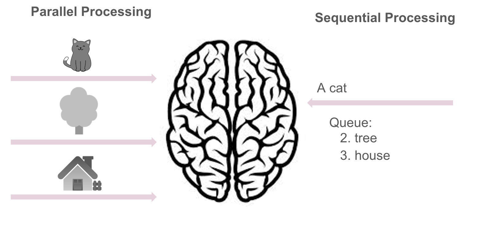
Vision is by far our most dominant sense, taking up about half of our brain’s resources. And most of that is optimized for pictures, not written words.
For one, images are processed in parallel, meaning we can take in several pictures at the same time, while verbal information is processed sequentially – meaning we process one chunk at a time. They are also processed in different parts of the brain.
So, by using pictures and models, we will both reduce the mental load of reading and remembering. And, we will also strongly increase the chances of the readers actually remembering the information. In addition, it is so much easier to condense information in a model, like a mind map, than it is to write it in a text. Even with things like bullet lists – you need to spell out so much more in order to convey the same message.
And lastly, since it is so superior – it is also more likely to spark discussions and find faulty assumptions than sending a very text heavy document over. It creates a common language not only usable for test scenarios but also system documentation, requirement specification. Sure, you might need to tweak the model to represent the different aspects but this is so much easier than rewriting a document.
There’s A Model For That
Let’s look into a few different types of common models and when and how you could use them.
Flow Charts
Flow charts take a process and break it down into sequential steps. It is a very generic tool that can be adapted for a wide array of different purposes as well as be used for basically any kind of process. It is great for understanding a process better, communicating, documenting or identifying flaws (room for improvement) in a process.
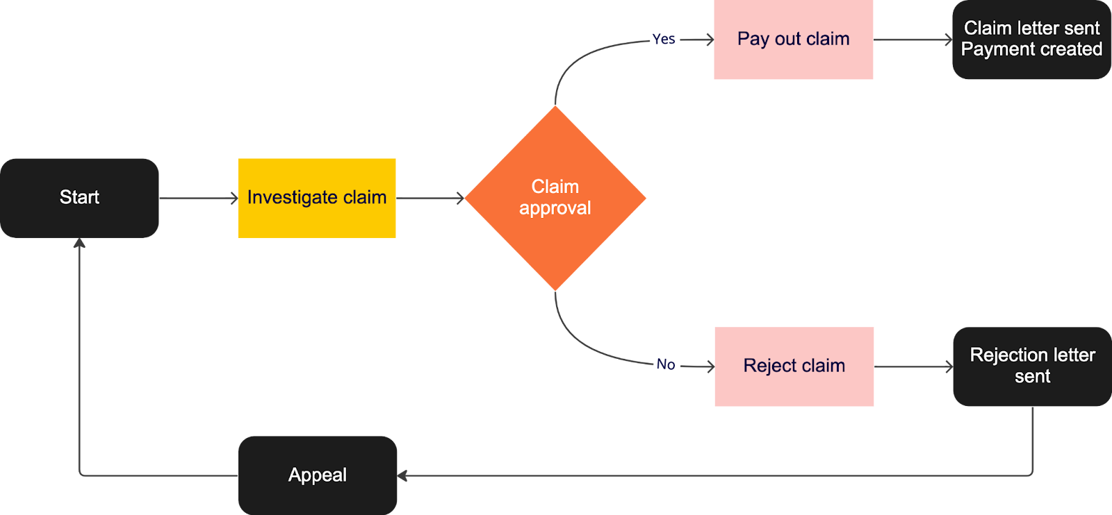
On the downside it can easily become very complex, since processes are rarely as black-and-white as we would like them to be. In the example above you see a very abstracted view of an insurance claim process. In reality this is often multiple different swimlanes and possible routes so it is imperative to be able to find a small and simple enough part of a process to document, in order for the flowchart to be useful. But then again, make it too small and it becomes less useful again.
State Diagrams
State Diagrams aim at visualizing a system in terms of states, where each state has a certain set of characteristics that are different from other states. It describes the system in terms of states, transitions and the events that occur as a result of those transitions. It is a great way of showing behavior in a system, as long as the potential states and transitions are small. Just like flow charts, it can very easily become overly complicated or require too much abstraction to be really useful.
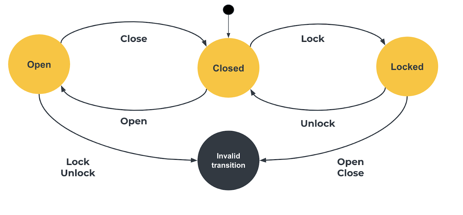
In software development, as in testing, it is a good way to identify test scenarios, since the transitions are great input to finding where things are likely to break, aka risks.
Database model
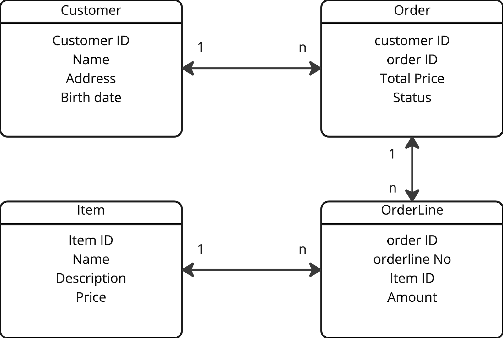
A database model is a view of tables, fields and relationships between them.
In the example below, you see an extremely simple table with customers, orders, order lines and items. In this example, a customer can have many orders but every order just one customer, an order many order lines but every order line belongs to exactly one order and every order line references one item while every item can exist in many order lines. In reality, databases are far more complicated and database diagrams can include a lot of more information, such as indexes, formats for fields, rules that are applicable and much more.
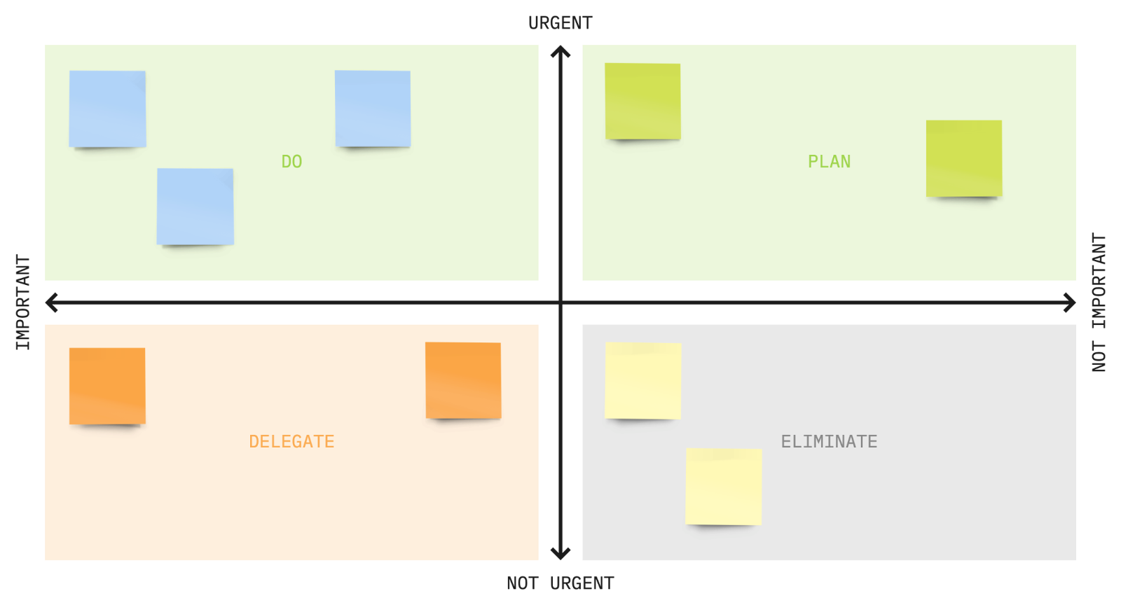
Time Management – Urgent vs. Important
Visual models come in many different flavors. The urgent vs important matrix is a great example of a visual model that has nothing in particular to do with software. It is an excellent tool for managing your time and prioritizing tasks, making sure you end up doing the most important things in the right order. We often end up spending too much time on urgent but not important things, which would be much better to plan time for so it does not become urgent, or non-urgent and not important things, that we would be better off just not doing at all. It is also great for finding things to delegate, things that are important but could likely be done by someone else. (with our support if needed)
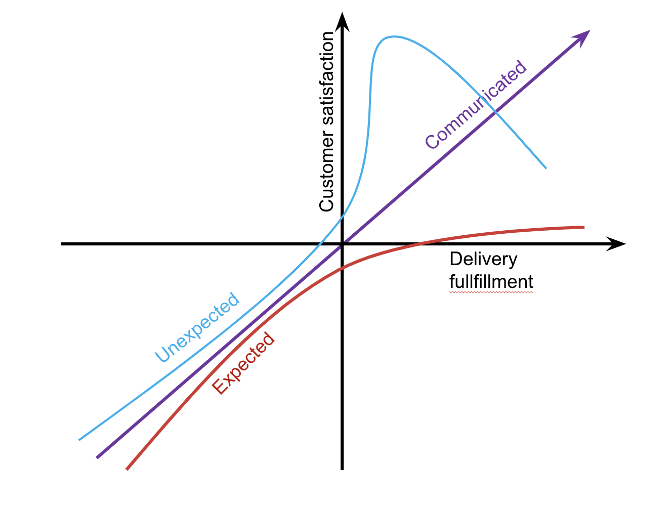
Kano model
The Kano model divides features into how happy they would make customers if delivered or not. The theory states that if we don’t deliver features the customer expects, but might not have communicated that they expect, they will be very disappointed. We need to identify those. Delivery of features they are not expecting are likely to delight them, while not delivering them will not affect customer satisfaction. This model is a good way of prioritizing your backlog, and also a good way of prioritizing your tests.
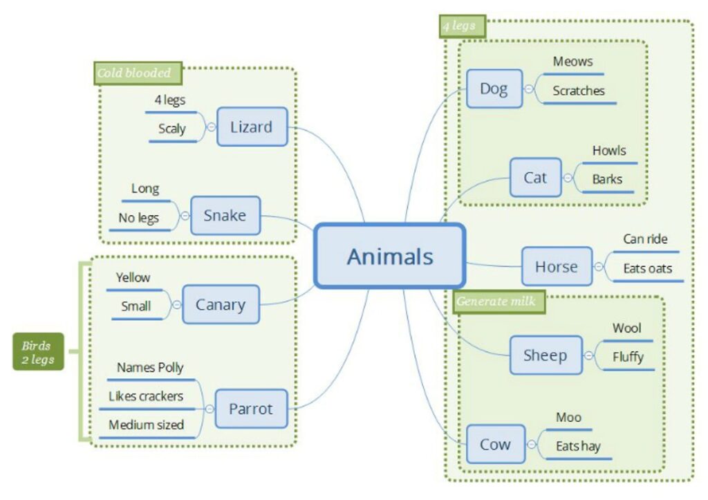
Mind Maps As Oracles
The visual model I tend to lean towards is the mind map, which I find is the perfect representation of test scenarios, requirements and system description for my particular brain. They can be used to visualize plans and relationships between scenarios, they can replace status reports and not least: they are excellent at defining requirements, business rules and detailing system behaviour.
They have limitations, as all models, especially when things start to become complex. At some point they basically become too complicated to keep track of. But to be fair – so do documents, which tend to become too big to be useful a lot faster.
Mind maps have, I find, a way of giving structure to information, adding boundaries and contexts with little to no overhead. I know it’s a matter of personal taste but for me – they allow my brain to grasp very complicated domains with just the right level of abstraction, without being restricted to a single format and allowing me to adapt and change the model as more information is found.
Doing them digitally fits my way of working best, since I can drag and move things around as I work my way to more understanding. It is also a great way of starting conversations and the low amount of effort needed to change it makes it perfect for collaborative work.
Checking Back With Our Project and our Test Lead
I set three ground rules for myself, in order to try to make this feel doable:
- Start with what you know – Figure out what you know, don’t panic over the unknowns
- Achievable – We will focus on the simple cases first (80%), add complexity if time allows.
- Simplify – Group similar behavior and use as much visuals as possible over text
”..there are known knowns; here are things we know we know. We also know there are known unknowns; that is to say we know there are some things we do not know. But there are also unknown unknowns”
– Donald Rumsfeld
First of all, we tried to figure out what we knew, and listed all things we needed to understand better.
To do this, I went through lots and lots of documents, database models and code. I put everything into one giant mind map of the different fields, configurations, business rules and other information that could be relevant.
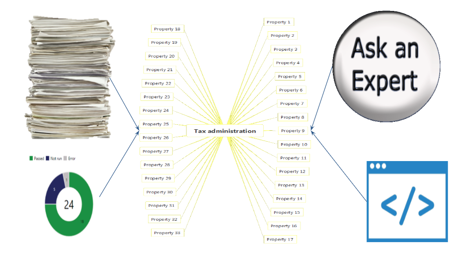
Using my different oracles (documentation, old test cases, code and my business expert) – I formed a set of hypotheses that could be verified or falsified. Rinse and repeat until we all could agree on a model that felt “correct”.
We grouped, we agreed on a common language, we gained an understanding. We went from a sad and stressed team and an angry group of users to collaborating and feeling like one team with one goal. We went from reviewing to discussing.
As a starting point, we agreed on a standard that we felt was achievable, using the Pareto principle as a base. You might know this by a different name: The 80/20 rule, the law of the vital few, the principle of factor sparsity. The principle states that for many outcomes, 80% of the consequences come from 20% of the causes. It was defined by Joseph M. Juran and weirdly seems to fit into almost any hole you try to put it into.
80% of the bugs are in 20% of the code. 80% of the usage of your system will be in 20% of the features. 80% of the work can be done in 20% of the total time. 80% of your sales will come from 20% of your clients. We agreed, in the team and with our main stakeholders, to focus on the “simple cases” first, and if needed the complex cases could be solved manually.
“ Pareto principle – 80% of the effects come from 20% of the causes”
While working, we made a number of interesting findings! We found that a lot of fields and business rules were no longer in use. Some might never even have been. These could be removed from the model, code and database. We found discrepancies between documentation, how the business expert expected things to work and the code. This ended up being so important we decided to scratch our initial “lift and shift” approach. The original plan was to change as little code as possible, just enough to make the new SQL database and the old Oracle database work exactly the same. When looking at the discrepancies, we realized we could save time by fixing the problems in the code – making the wanted behaviour match the code – which in turn allowed us to remove a lot of code. Such as an entire feature for manual adjustments, not needed anymore. An entire feature had been built because the developers and the subject matter experts had not been able to understand each other.
We carried out the testing by printing the mind maps on paper, running the tests and checking them off. By having these models, I could easily combine and reuse tests. I reduced my original combinations by traditional equivalence classes and pairwise testing. I could easily cover 10-20 of my original test cases in a few minutes – covering all of the relevant cases in a few days of testing, all of this while feeling completely confident in the coverage. Our business/acceptance testers found very few bugs when they took over and the handover turned from painful to fun.
In the end, it took me three days to cover my estimate of 7 188 480 combinations (or rather: all of the combinations that were actually possible and relevant)
Using these visual models we increased our coverage with reduced testing time. We found a more maintainable way of documenting both test scenarios and requirements, reducing misunderstandings. It increased our business understanding and made it easier to onboard new people. Since the format of a mind map doesn’t allow for many words you are forced to remove all excess and get to the heart or things. No business language. No tech speak. Just examples, pictures and a few words. You can’t hide.
In conclusion
Models are fallible but useful tools.
A picture does speak louder than words.
Impossible can become possible if we change our perspective and open ourselves to try something new.
Go try something bold, make me proud!